How To Read A Meme Chart Without Crying
Candles are just rectangles with opinions. Here's how to look at one and keep your lunch down.
By Chief Noodle · Published · Updated · 5 min read
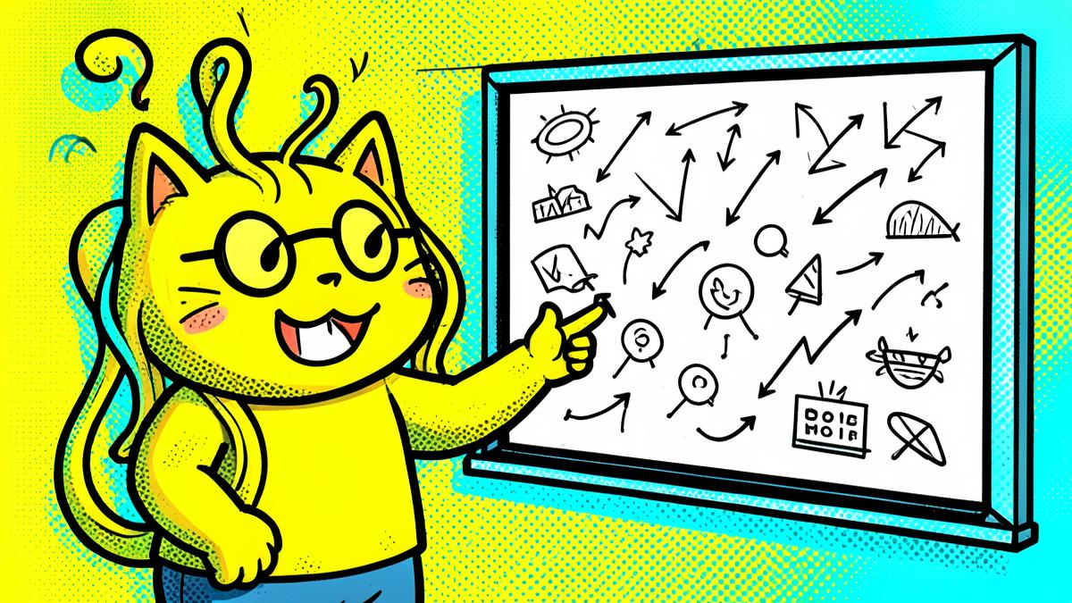
A candle is a rectangle with feelings
Green means it went up during that slice of time. Red means it went down. That is the entire secret. Everything else you have been told at 2am by an anonymous frog account is decoration.
The wick — the thin line poking out — shows how far price stretched before it changed its mind. Long wicks mean somebody panicked and then somebody else panicked in the opposite direction. Very normal. Very human.
Zoom out until it stops hurting
On a one-minute chart, every sneeze looks like a collapse. On a weekly chart, the same sneeze is a pixel. Meme tokens move fast, and the shorter the timeframe, the more emotional damage per screenful.
Our house rule: if you're checking more often than you eat, you're not investing, you're doomscrolling with extra steps.
- 1-minute chart: for people who enjoy suffering
- 1-hour chart: for people who want context
- 1-day chart: for people who want to sleep
Volume is the honest one
Price can be nudged. Volume is harder to fake. When a move happens on real volume, more people actually changed their minds. When it happens on nothing, it usually un-happens by morning.
Check the numbers yourself on the tokenomics page, then form your own opinion. We would rather you be sceptical than loyal.
The part where we remind you it's a meme
$HUB is a joke that got organised. It has a mascot, a community, and a very good group chat. It does not have earnings, a board of directors, or any obligation to go up. Read the disclaimer in the footer and take it seriously, even though everything else here is silly.
About Chief Noodle
Head of Slurping
Writes the words, feeds the cat, refuses to look at the chart before coffee.